Certificate in Responsive Web Design: Build Mobile-First Sites
Earn a Certificate in Responsive Web Design, learning to build mobile-first sites that are adaptable and user-friendly.
Certificate in Responsive Web Design: Build Mobile-First Sites
Programme Overview
The Certificate in Responsive Web Design: Build Mobile-First Sites is a comprehensive program designed for web developers, designers, and digital professionals aiming to enhance their skills in creating user-friendly, accessible, and visually appealing websites that adapt seamlessly across various devices and screen sizes. This program covers the entire lifecycle of mobile-first web development, from understanding the principles of responsive design to implementing design systems that prioritize mobile experiences and improve load times and user engagement. Learners will gain hands-on experience using HTML5, CSS3, and JavaScript to craft responsive layouts and interactive elements, as well as learn best practices for content optimization and performance tuning.
By the end of this program, participants will master key skills such as utilizing media queries and flexible grids, developing responsive typography and images, and ensuring web accessibility. They will also become proficient in using front-end frameworks and tools that facilitate rapid prototyping and deployment. These skills are essential for creating websites that not only look great on mobile devices but also provide an optimal user experience on desktops and tablets.
This certificate program significantly enhances career prospects for web developers and designers by equipping them with the latest tools and methodologies to create responsive web designs. Graduates will be well-positioned to work on complex web projects that require adaptive design strategies, improving their competitiveness in the job market. Additionally, the skills gained can lead to career advancement opportunities in roles such as front-end developer, web designer, or user experience designer, where the ability to create responsive and mobile-first websites is highly valued.
What You'll Learn
Embark on a transformative journey into the world of modern web design with our comprehensive 'Certificate in Responsive Web Design: Build Mobile-First Sites.' This program equips you with the essential skills to create visually appealing, user-friendly websites that seamlessly adapt to various devices and screen sizes. By focusing on mobile-first design principles, you'll learn to craft responsive layouts, optimize images, and implement effective content strategies that enhance user engagement and satisfaction.
Key topics include HTML5, CSS3, media queries, and front-end frameworks like Bootstrap. You will also delve into user experience (UX) design, accessibility, and performance optimization techniques. Throughout the program, you will work on real-world projects, applying your knowledge to build and refine websites, ensuring they meet the demands of today’s diverse digital landscape.
Graduates of this program are well-prepared for a variety of roles, including web developer, front-end developer, or UX/UI designer. With the growing demand for mobile-friendly websites, this certificate opens doors to exciting career opportunities in tech companies, digital agencies, and startups. Whether you are a seasoned professional looking to update your skills or a beginner eager to enter the tech field, our 'Certificate in Responsive Web Design' provides the foundation to succeed in the dynamic world of web development.
Programme Highlights
Industry-Aligned Curriculum
Developed with industry leaders for job-ready skills
Globally Recognised Certificate
Recognised by employers across 180+ countries
Flexible Online Learning
Study at your own pace with lifetime access
Instant Access
Start learning immediately, no application process
Constantly Updated Content
Latest industry trends and best practices
Career Advancement
87% report measurable career progression within 6 months
Topics Covered
- Introduction to Responsive Web Design: Covers the basics of creating web designs that adapt to various devices.: HTML5 and CSS3 Basics: Focuses on essential elements and properties for building responsive web pages.
- Media Queries and Layout Techniques: Teaches how to use media queries and various layout methods for responsive design.: Flexbox and Grid Layouts: Explores the use of Flexbox and CSS Grid for creating flexible and responsive layouts.
- Images and Icons for the Web: Discusses best practices for optimizing images and icons for responsive sites.: Testing and Debugging Responsive Designs: Provides strategies for testing and troubleshooting responsive web designs across different devices.
What You Get When You Enroll
Key Facts
Audience: Web developers, designers, enthusiasts
Prerequisites: Basic HTML, CSS knowledge
Outcomes: Build mobile-first responsive sites, enhance user experience
Ready to Advance Your Career?
Join thousands of professionals who have transformed their careers with LSBR UK
Why This Course
Enhanced Marketability: Individuals who earn the 'Certificate in Responsive Web Design: Build Mobile-First Sites' significantly enhance their marketability by acquiring in-demand skills. This certification demonstrates a deep understanding of responsive design principles, which are crucial for creating user-friendly websites that adapt to various devices and screen sizes.
Skill Development: The course focuses on building mobile-first sites, a critical approach in today’s digital landscape. Participants learn to use modern web technologies and frameworks like HTML, CSS, and JavaScript, along with responsive design techniques such as media queries and flexible grids. These skills are essential for developing websites that provide seamless user experiences across desktops, tablets, and smartphones.
Career Advancement: By mastering responsive web design, professionals can advance in their careers by taking on more complex projects that require a broader range of skills. The ability to create and maintain responsive websites can open doors to higher-level positions such as web developer, front-end developer, or UX/UI designer, where they can lead teams or manage larger projects.
3-4 Weeks
Study at your own pace
Course Brochure
Download our comprehensive course brochure with all details
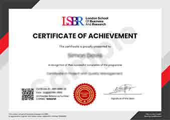
Sample Certificate
Preview the certificate you'll receive upon successful completion of this program.
Get Free Course Info
Receive detailed course information, curriculum breakdown, and career outcomes straight to your inbox.
Employer Sponsored?
Many employers cover professional development costs. Request a corporate invoice and we'll handle the rest. Bulk enrollment discounts available for teams of 3+.
Your Path to Certification
Four simple steps to your professionally recognised qualification
Enroll & Get Instant Access
Complete your enrollment and access course materials immediately
Study at Your Own Pace
Work through the modules on your schedule, from anywhere in the world
Complete Assessments
Demonstrate your knowledge through practical, real-world assessments
Receive Your Certificate
Get your official LSBR UK certificate, recognised across 180+ countries
Join Thousands Who Transformed Their Careers
Our graduates consistently report measurable career growth and professional advancement after completing their programmes.
What People Say About Us
Hear from our students about their experience with the Certificate in Responsive Web Design: Build Mobile-First Sites at LSBR UK - Executive Education.
Sophie Brown
United Kingdom"The course content is incredibly thorough and well-structured, providing a solid foundation in responsive web design that has significantly enhanced my ability to create mobile-first sites. I've gained practical skills that are directly applicable to real-world projects, making me more confident and competent in my work."
Priya Sharma
India"This course has been instrumental in enhancing my ability to create responsive designs that are not only visually appealing but also highly functional across various devices. It has significantly boosted my career prospects by equipping me with the latest industry standards and practical skills needed to build mobile-first sites that meet user expectations."
Ryan MacLeod
Canada"The course structure is well-organized, providing a clear path from basic concepts to advanced techniques in responsive web design, which has significantly enhanced my ability to build mobile-first sites that are both functional and user-friendly. The comprehensive content not only covers theoretical aspects but also includes practical examples that have been invaluable for applying my knowledge in real-world scenarios."
Still deciding?
Join 23,000+ professionals who advanced their careers. Enroll today and start learning immediately.
Enroll NowSecure payment • Instant access • Certificate included